PRISMA
Branding & Packaging, 2024
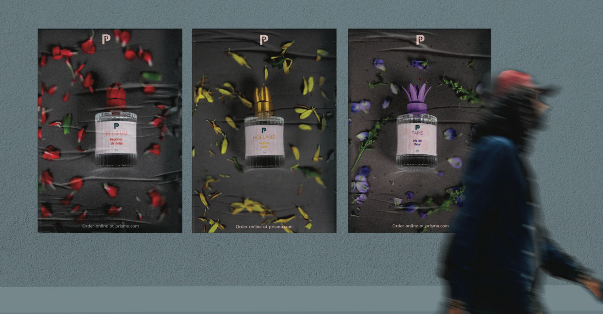
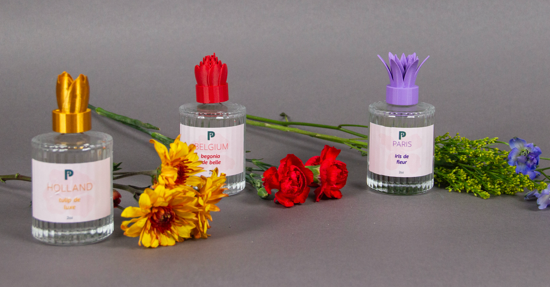
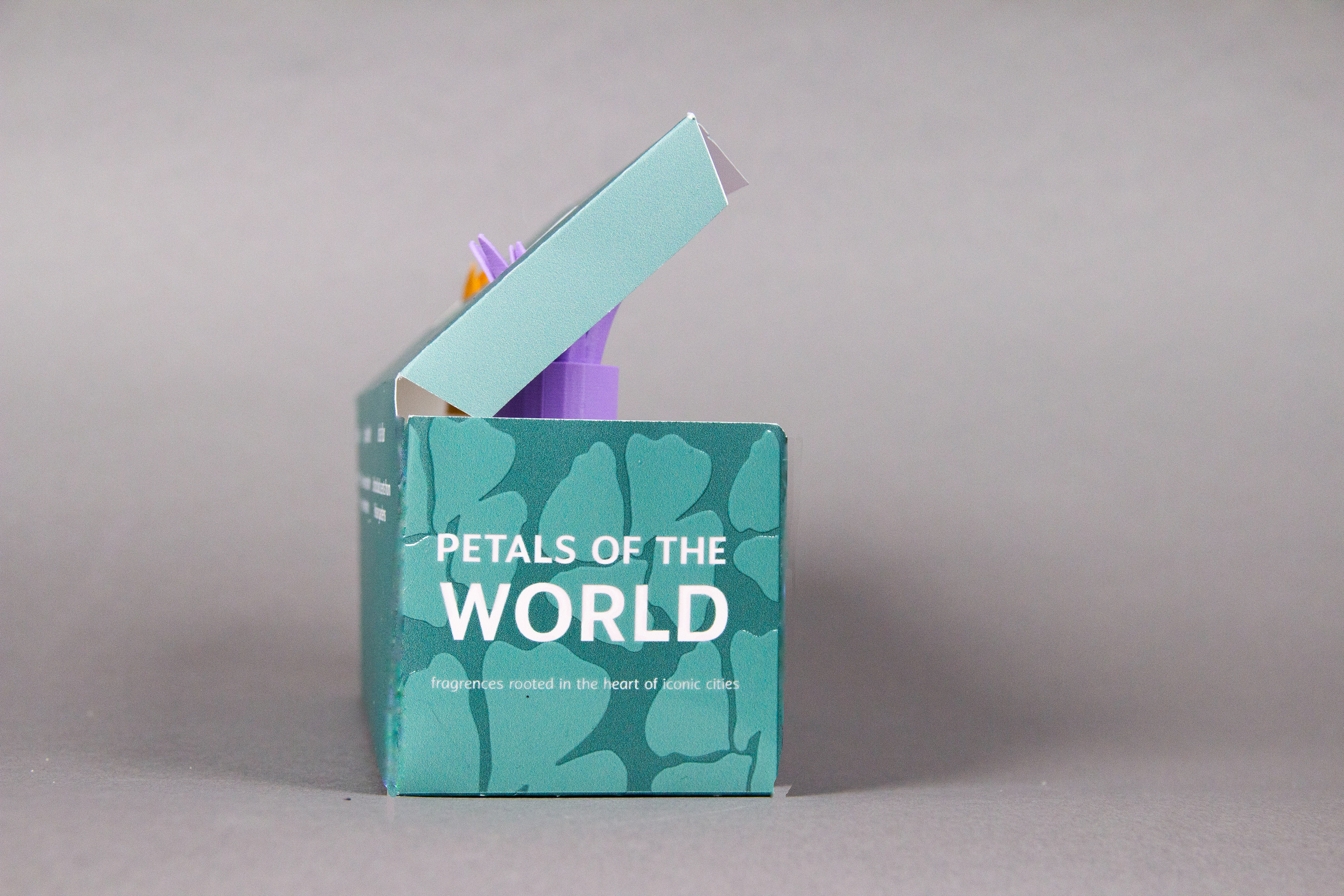
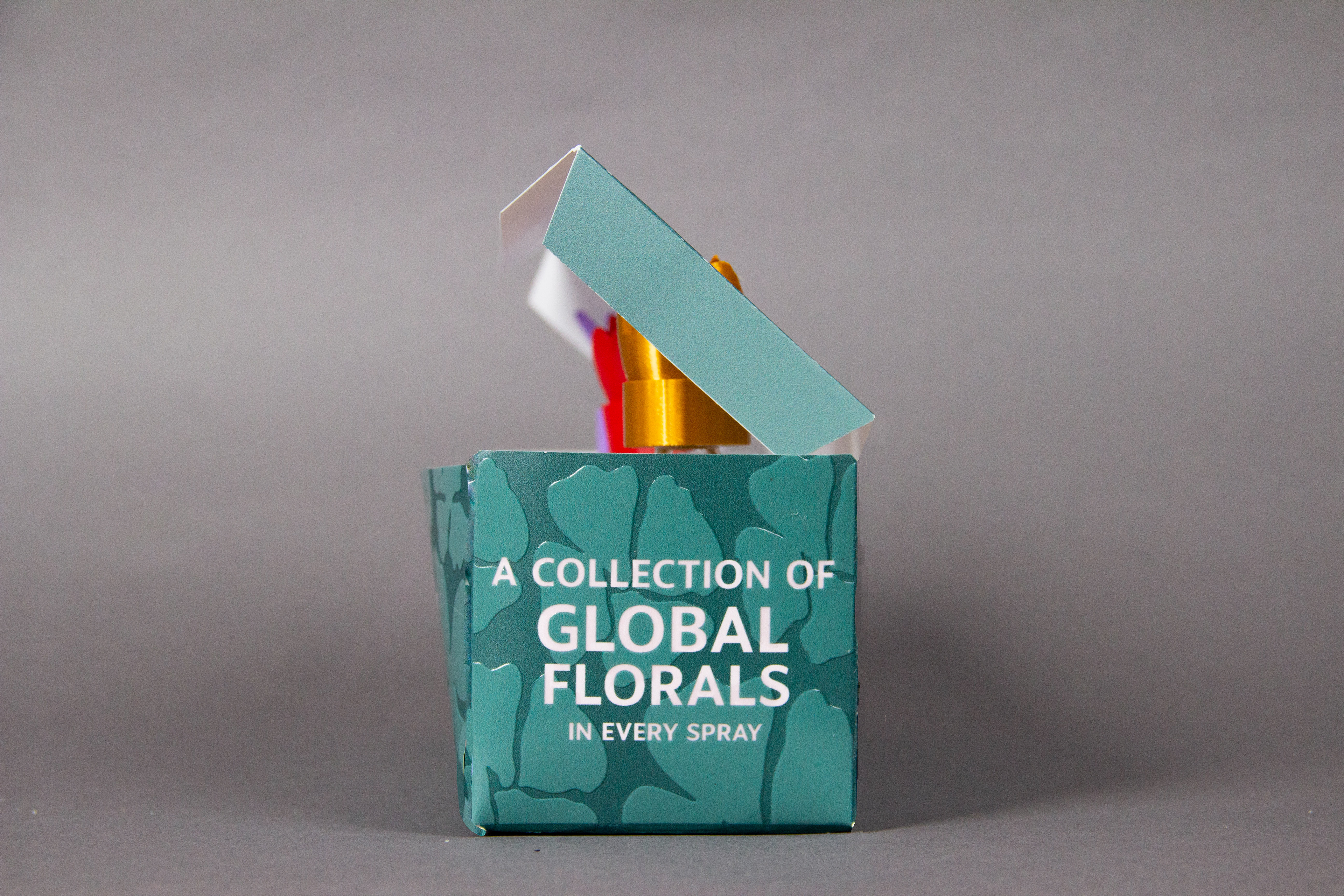
Prisma is a brand for those who see beauty as a form of self-expression. I wanted this project to reflect the brand’s bold, expressive, and youthful spirit. While floral perfumes are often seen as soft and romantic, my aim was to reimagine them as vibrant, contemporary, and culturally rich. This led me to create a limited-edition series inspired by flowers native to different countries, giving each fragrance its own unique personality while still feeling like part of a cohesive collection. The green color of the packaging evokes the essence of a lush flower bed, reinforcing the floral theme throughout the collection.
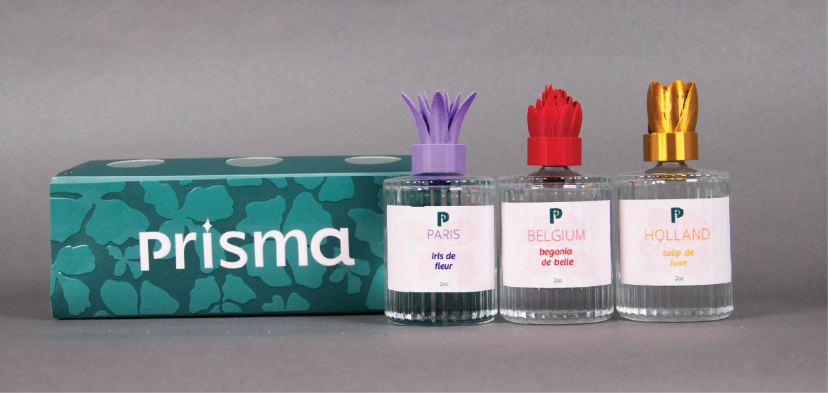
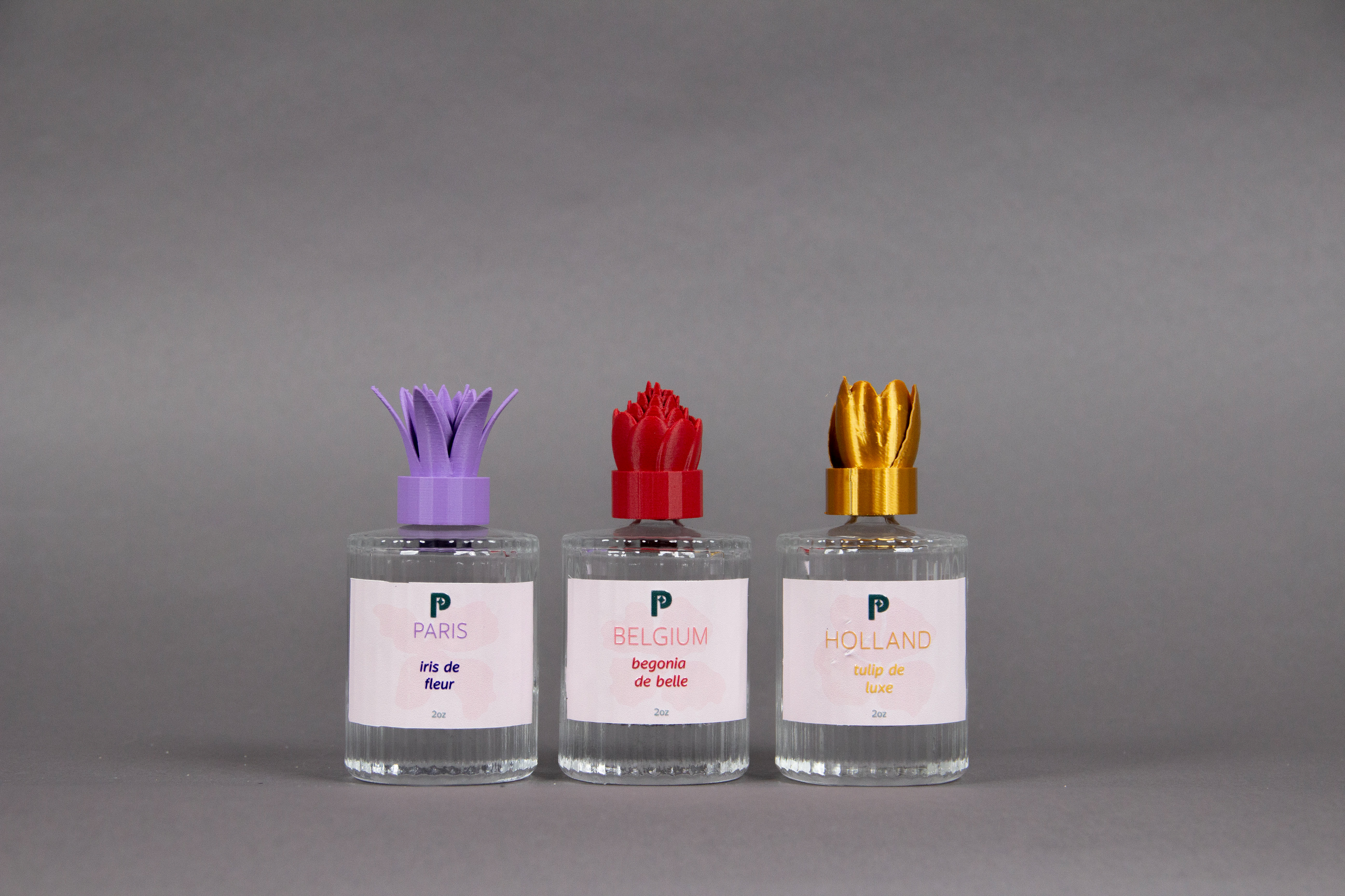
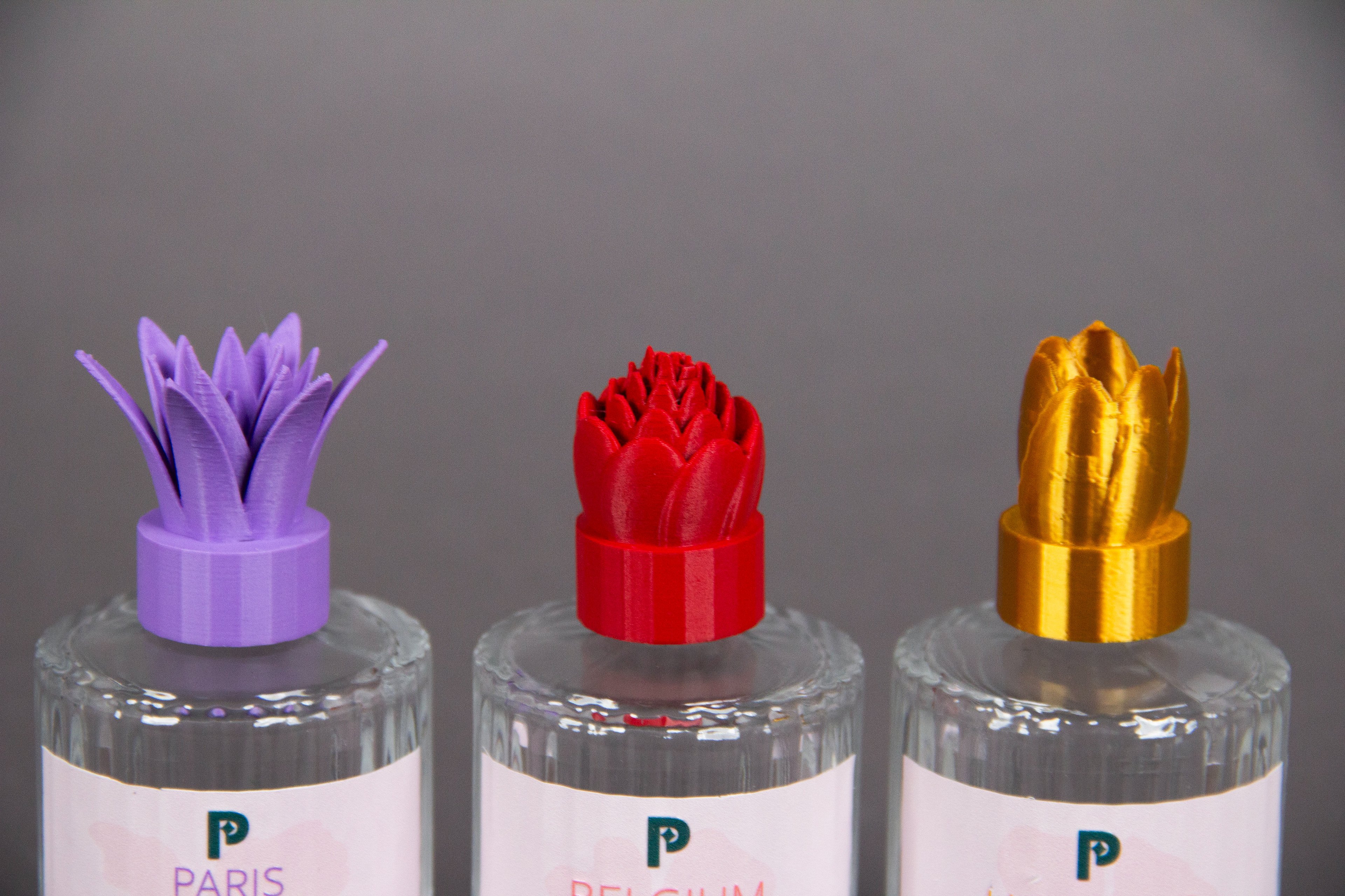
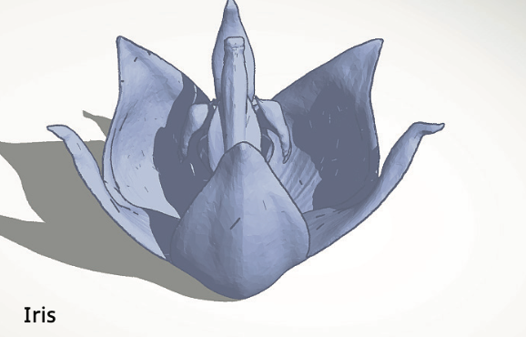

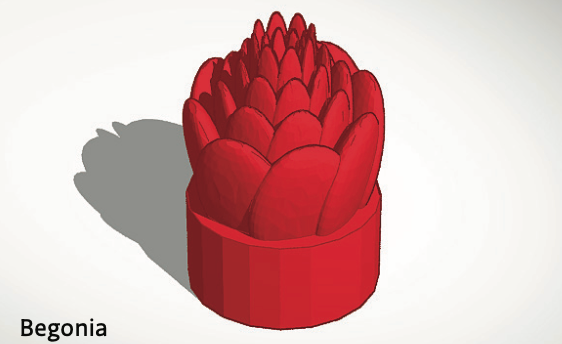
The collection also features custom-designed, 3D-printed caps, each one modeled after the shape of the flower it represents. This unique design adds a personal touch to the bottles, reflecting the elegance of the flowers in a modern, artistic way.

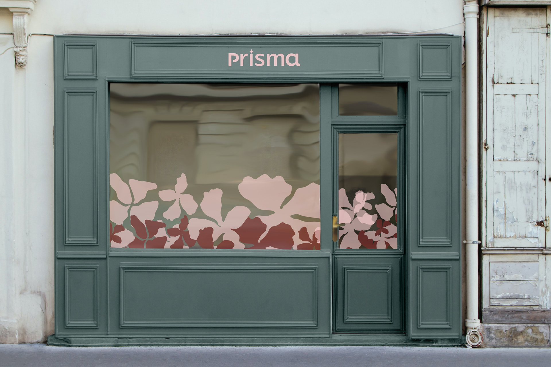
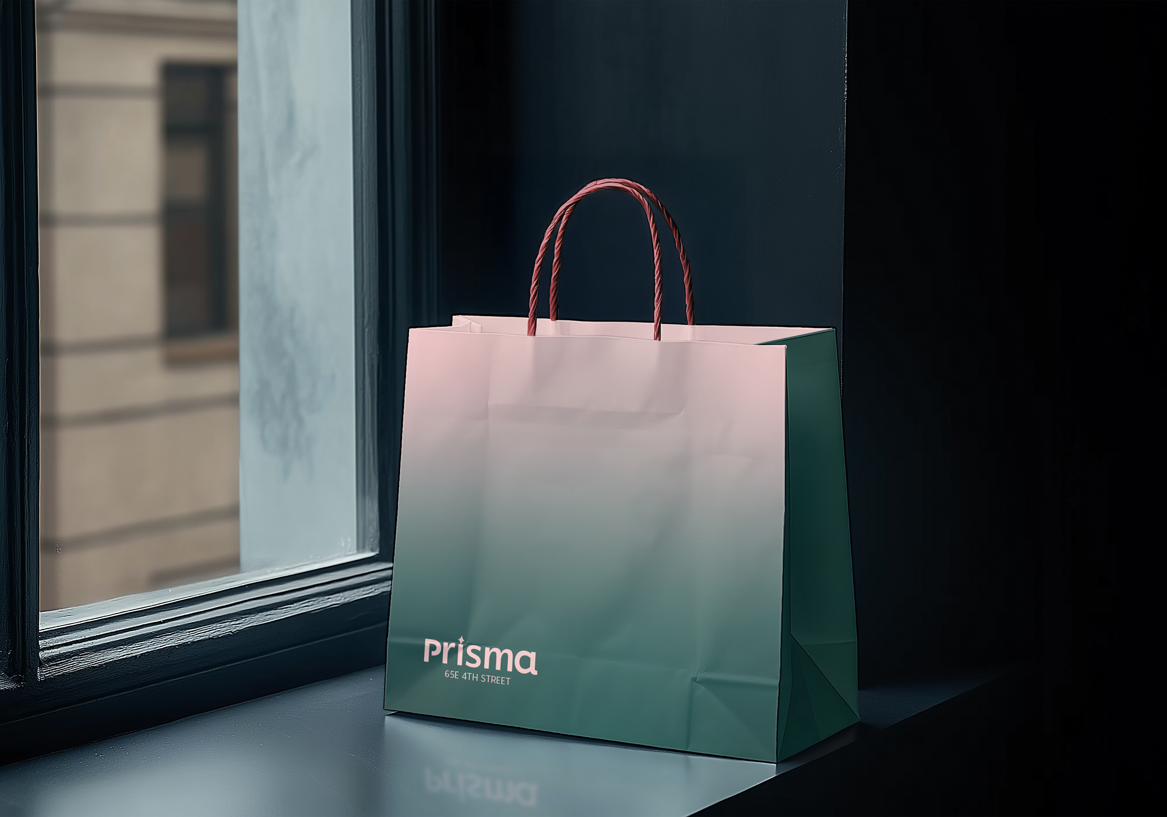
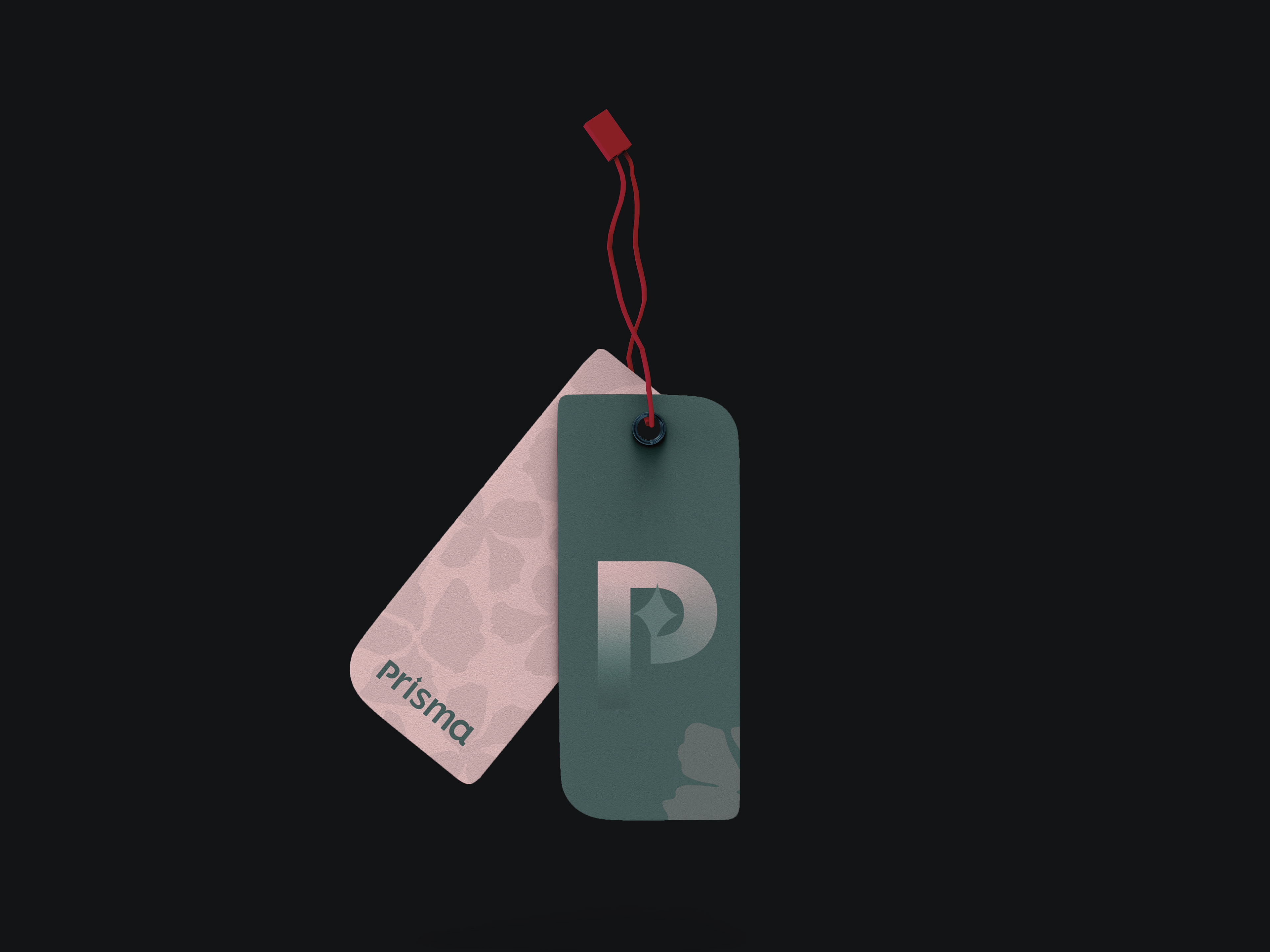
To bring the perfumes into a larger retail world, I designed a Prisma storefront concept, along with shopping bags and bag tags. These carried the same pink and green tones from the perfume packaging, but here the two colors blend into a soft gradient — creating a fresh, modern backdrop for the products. The storefront windows display oversized floral silhouettes and the bottles as centerpieces, while the bags and tags feel like keepsakes, making the unboxing experience as memorable as the fragrance itself.